In Task 1, the test takers are provided with a table, chart, graph, etc. and must mention, summarize, or explain the facts in their own words. They are supposed to describe and explain data, all the stages of a process, and how something works or describes an object or event. The main reason behind including this task is to see how well a student is able to present the information and present the facts on paper.
In the General Training module, the test takers must write an informal or formal letter. The minimum required word limit is 150 words. In case, a candidate writes less than 150 words, then they will be penalized. However, adding a few more words to the text will not attract a penalty.
As per the IELTS exam criteria, test takers taking up Task 1 will be marked as per the four criteria including:
In Task 1, the test takers will be provided with any of the following graphics:
And they are supposed to write a short report related to the main features. The test takers are asked to summarise the data, and highlight the main features.
The Tips to Improve IELTS Academic Writing Task 1
To improve your overall performance in this section of the IELTS exam, here are some tips:
Though it might look like an obvious tip, this is important to mention as many times students overlook it. The test takers must not feel stressed out, rather they must take a minute to go through all the instructions carefully and try to understand what is being asked.
The test takers must carefully look at the task type first and think about what they have to write before taking a pencil. If you are not clear, do not start writing it down. Try to have a clear picture in your mind before starting to write.
Many IELTS candidates get confused while using tenses. They either end up using the incorrect tenses or use a combination of wrong tenses, both of which result in score deduction. To avoid such kinds of issues, make sure you know the tenses very well. For instance, if the figures are mentioned in the present tense, you need to write answers in the same tense only.
Another important thing to consider here is to use relevant language when it is about presenting the information or comparing graphs. There can be many instances when you have to write the same thing in different ways, so make sure you use the correct form of language. Try to be innovative and do not repeat anything.
Do not just copy the answers; you need to paraphrase the content. Since the examiner’ pay detailed attention to all the content, you need to be very careful while writing the content as copying the content can result in losing marks. Paraphrasing is very important and test takers will get scores accordingly.
Regarding vocabulary, use the right combination of words that helps get a good score in the exam. The examiner checks how many adequate and relevant words have been used in the test, and how smartly one has used the same to present his/her opinion. Also, in case you want to get a band score of 6 or more than that, you must use complex grammar and structured sentences while presenting your opinion.
Practice, practice, and more practice is the key to getting a good score in the exam.
Format to follow
Body Paragraphs
Bar Chart
They are the most common Task 1 questions. The data could be presented in a vertical or a horizontal form, and test takers are supposed to summarize the same.
For example:
The bar chart mentioned below presents the total whales, seals, and dolphin’s data provided in the Gormez Straits between 2006 and 2018. In this given task, the test takers are supposed to summarise the presented information by choosing and mentioning the primary features and making comparisons where relevant.
Make sure to write a minimum of 150 words.
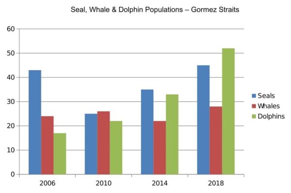
The bar chart above is the evidence of data in the Gormez Straits that represent the total number of sea creatures present between 2006 and 2018. The three different colours have been used here to represent seals, whales, and dolphins. In the year 2006, Seals were on the higher side and Dolphins were on the lower side while the number of Whales present there was in mid of both.
The 2010 bar chart marks the presence of Whales in highest quantity, followed by Seals and Dolphins. Again in 2014, Seals were in maximum number, followed by Dolphins, and Whales on the least side. If we talk about the total number of whales, seals, and dolphins in 2018, Dolphins were in the maximum number, followed by Seals, and Whales on the least side.
The bar chart here is used to represent the total number of sea creatures in the Gormez Straits available between 2006 and 2018. It clearly demonstrates that the number of sea creatures in 2006, 2010, 2014, and 2018 have not remained constant. There has been an increase and decrease in their numbers.
(184 Words)
Line Graph
Line graphs are another common part of IELTS Academic Writing Task 1. Compared to other kinds of tasks, Line Graphs are quite easy to interpret.
For example:
The provided graph below mentions the population of China and India from 2000 and predicts the increase in population till the year 2050. In this task, the test takers are supposed to present the information by choosing and reporting the main features, and make comparisons where relevant.
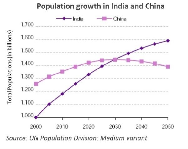
Population today is a matter of concern for the world. Here, we are going to talk about the two Asian economies not only growing economically but also has population blast. The provided line graph here represents the population growth of the two countries China and India staring from the year 2000.
As evident, the Indian population in 2000 was 1000 billion and the Chinese population was 1200 billion which increased in 2010 to 1100 billion in India and 1300 billion in China. The line graph further reveals that the two countries population continued to grow at a fast speed. In 2020, Indian population reached 1300 billion and Chinese population to 1400 billion.
It is noticeable that India witnessed a sharp rise from 2000 to 2050 in the population, that is, from 1000 billion to 1,600 billion. However, in case of China, steep increase was observed from 2000 to 2020, followed by a gradual fall till 2050.
The line graph clearly predicts the unexpected increase in population for India till the year 2050. The source of information here is the UN Population Division.
(182 Words)
Table
Many times, the information is also presented in the table form in Task 1. A few test takers find it difficult to interpret the facts as they are just sets of numbers with no visual representation. However, understanding the numbers is not a difficult task. Since the IELTS exam is designed to evaluate the language skills of the candidates, so it has nothing to do with the mathematics ability.
For example:
The tables provided below present information regarding the world population and distribution in 1950 and 2000, with an estimate of the situation in 2050. Now the test takers are supposed to summarise the information by choosing and mentioning the main highlights and make comparisons where relevant.
Write at least 150 words.
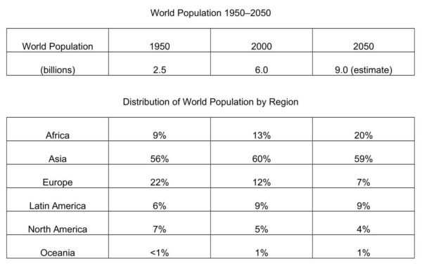
The table illustrates the percentage of world population in the different continents in 1950 and 2000. It also presents the estimate and the situation of population in 2050. It is evident that the world population in 1950 was 2.5 billion which increased at a fast pace and is recorded 6.0 billion in 2000. The table also illustrates the estimated world population in 2050 to be 9.0 billion. The table further describes the world population distribution by region in 1950 and 2000 along with the estimated population in 2050.
To begin, the population recorded in 1950 in Africa, Asia, and Europe was 9%, 56%, and 22% respectively. In 2000, the regions like Latin America, North America, and Oceania recorded the population 9%, 5%, and 1% respectively. The regions like Africa, Asia, and Latin America have witnessed growth in population in the year 2000 in comparison to the population in 1950. On the other hand, the regions namely Europe and North America have recorded decrease in population growth.
To conclude, the estimated population in 2050 for Africa is on higher side in comparison to 1950 and 2000 whereas Asia, Europe, and North America have the estimation of decrease in population in 2050. The table is also the evidence of the highest recorded population in Asia and lowest in Oceania. Thus, the table has made the distribution of world population by region easy to understand.
(233 words)
Pie Chart
Though pie charts are not very common as bar charts and line graphs, still sometimes they are included as a part of IELTS writing task 1. Pie charts are another great way of visually presenting data.
For example,
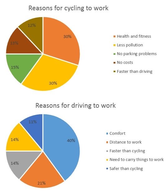
The chart provided below mentions the reasons why people travel to work by bicycle or by car. Now use the same information, key features, etc. to make a meaningful comparison.
The word count must be a minimum of 150 words.
The Pie Chart above is used to detail the key reasons for cycling to work and driving to work. It also illustrates the reasons with percentage of the people using cycle and car to drive for work.
Firstly, the major reasons for cycling to work include health and fitness, less population, no costs, no parking problems, and faster than driving. Now, we look at the percentage given to each reason. This percentage is represented in the pie chart using different colours. The people cycling to work for health and fitness are 30 percent and for the less population reasons the percentage are also 30. The people who use cycle to reach workplace for the reasons like no parking problems, no costs and faster than driving are 15%, 13, and 12% respectively.
The second pie chart covers the percentage of people driving to work for a host of reasons. The key reasons for driving to work include comfort, distance to work, faster than cycle, safer than cycling, and the need to carry things to work. Each reason above is illustrated using unique colours. It can be witnessed that the reason ‘comfort’ has achieved the maximum stake of 40 per cent. The reason ‘safer than cycling’ gets the lowest of 11 per cent. The reasons namely the need to carry things to work, faster than cycling, and distance to work has scored 14, 14, and 21% respectively.
(Words 235)
Process Diagram
Process Diagram is another task which consists of a natural process like the water cycle, a manufacturing process, or the diagram of a system like a central heating system in a house.
For example –
The diagrams present a structure useful in generating electricity from wave point. Here the test takers need to summarise the given facts by tapping and highlighting the main features and make comparisons where necessary. The word count must be not less than 150 words.
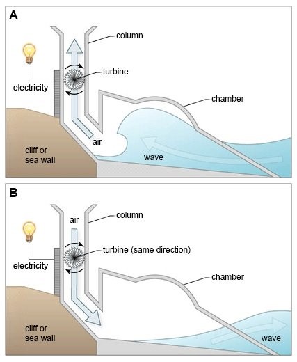
The process diagrams give a pictorial illustration of structure that is used to generate electricity from wave point.
As observed, electricity generation is a complex process and needs a careful execution. Here, diagram A demonstrates the key essential elements that include wave, cliff or sea wall, chamber, air, turbine, and column used to generate electricity. Each element has its own importance and function, and these elements together help in the complete process of electricity generation.
Both the process diagrams A & B illustrates the construction of columns constructed along with the sea wall. The turbine for the flow of air can be seen within the column. The turbine moves in the same direction and is fixed in a way that it can move smoothly. The waves are compressed and decompressed by the turbine movement. It is channeled using a wind turbine generator for the electricity production.
The diagrams show that waves are converted to electricity using the wave energy and for the same the structure is illustrated using the two process diagrams A & B.
(Words 175)
Map
Sometimes, the IELTS Academic Writing Task 1 question consists of a map. The test takers are asked to compare two or three maps of a place over a period of time similarly to the way asked in this question.
For example –
The diagrams presented below mention the changes that occur at Queen Mary Hospital since inception in 1960. Summarise the information by choosing and mentioning the key features, and make comparisons wherever needed.
Write not less than 150 words.
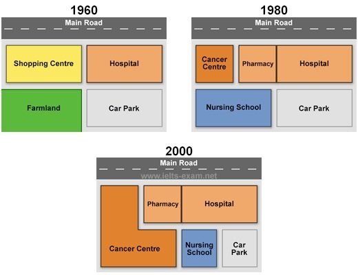
(Source – ielts-exam.net)
The multiple maps are used to illustrate the changes that took place at Queen Mary Hospital since its establishment in the year 1960. These maps seem self-explanatory and help to identify substantial changes occurred at the Queen Mary Hospital.
To begin, the 1960 maps show a dedicated space for shopping centre and a farmland whereas the 1980 maps mark the redesigning done. According to the 1980 diagram map, a cancer centre and pharmacy has been setup in place of shopping centre displayed in 1960 map. Further, the farmland in map 1960 displayed in green colour is replaced by a Nursing School.
The map of the year 2000 witnesses the expansion of the Cancer Centre. The space allocated for the Nursing School in 1980 map is used to expand the Cancer Centre. The Nursing School is made in 2000 within the space allocated for Car Park in 1980. The main road to the hospital remains same since its inception in 1960 until 2000.
Thus, the three different maps of 1960, 1980, and 2000 above illustrate the changes taking place within the Queen Mary Hospital premises at varied intervals.
(Words 187)
Multiple Graphs
Multiple graph questions have more than one type of diagram and very common form of task. In most cases, they consist of two diagrams like a bar chart and a line graph or a pie chart and a table as in this sample question.
For example –
The diagrams provided below mention the facts on transport and use of car in Edmonton. Brief the facts carefully by selecting the key features, and put a comparison among them.
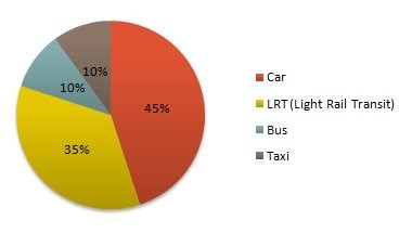
Mention the same in minimum 150 words.
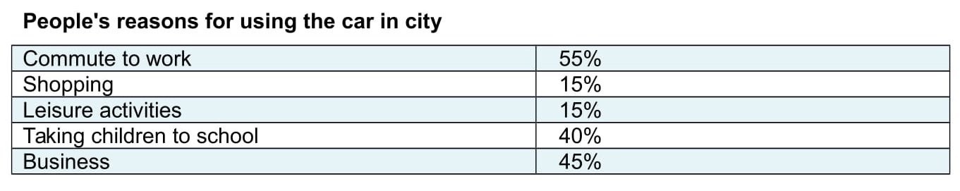
The multiple diagrams are used to explain the reason of people for using car in the city Edmonton. The first diagram represents the user percentage. There are different colours used to represent various means of transportation.
It is evident from the first diagram that 45% of the people in Edmonton city use car for one or the other reasons. So, car is used by the maximum number of people to move from one place to another. LRT (Light Rail Transit) has the second largest users in the city. The percentage of users using bus and taxi is 10%.
The second graph illustrates the percentage of reasons for which car is used to commute. The reason using a car to commute to work gets the highest voting of 55% followed by the reason for business purpose, that is, 45%. In this race, the third position is achieved by the reason taking children to school and it gets the score 40%. The people using car in the city for shopping and leisure activities comes in the 15% bracket each.
(Words 177)
Types of letters
In IELTS General Writing Task 1, the test takers can be asked for 2 kinds of letters:
Before starting letter writing, it is important to completely understand which kind of letter the test takers have to write.
Formal Letter
A formal letter is written to a company or organisation where you do not know the person to whom you are writing the letter. A letter written to a bank’s manager, or at a foreign university, is categorized under formal letters.
Most of the formal letters are written to mention complaints, take admission, apply for resignations, make arrangements, etc.
You have recently bought a piece of equipment for your home but it did not work. You phoned the shop, but no action was taken.
Write a letter to the shop manager. In your letter:
say what you would like the manager to do
Sample letter – Formal
Dear Sir,
I am writing this letter to express my dissatisfaction regarding the defective smart LED which I bought a week ago from your store. I am a regular customer of your store and I have never faced such kind of problem in the past.
Firstly, the main issue which I faced due to this is that its applications are not working properly. Also, I am not able to understand the functioning of some features of this product. I believe there is some confusion. I believe it is the duty of the store manager to check every piece properly.
Hence, I called up your store but there was no response. Then, I reached out to you Customer care services to hear that they do not know what is wrong with the LED and hence, want me to contact some other department, where again nobody is responding to my request.
I would be really grateful if you could help me out by sending the replacement of the product. You can send an executive to help me understand the features.
Kindly reply at your earliest convenience by highlighting the most suitable actions for you.
Yours faithfully,
Abhay Kumar
Informal/Personal Letter & Sample
Informal letters are written to a friend, family member, or someone you know personally. These kinds of letters are written for invitation purposes, explanations, informative letters, apology (all these letters can be semi-formal as well).
Basic strategies to follow while writing a letter
Informal Letter Topics (not below 150 words)
Below can be a few topics for informal/personal letter:
Sample informal Letter
You borrowed a mobile from your friend for few days. Due to some reason, it got damaged and stopped working.
You have to write a letter that should include –
Model Answer
Hello Raj,
I Hope you are doing well! Let me express my gratitude for allowing me to use your spare mobile phone. The mobile has great features and helps fulfill my need of using the Smartphone for the training classes. I would like to apologize beforehand for the problem I am going to share with you next. I was very happy and careful. Unfortunately, the phone incurred screen damage.
Yesterday, after attending the evening class I walked in the drawing room to charge the mobile phone. There was water spread on the floor that I did not notice and happened to fell. The Smartphone fall off my hand that resulted in the phone screen damage. I felt very bad of it.
However, I would like to tell you that I have visited a mobile repair shop near my place to get the problem fixed. I have given the mobile for repair and will get it back in next two days. The good thing is that my classes had ended and now I do not need a phone anymore. I will return it to you after it gets repaired.
I apologize for the situation and thank you for sharing your Smartphone with me.
Your’s loving friend,
Sameer
(Words 202)
